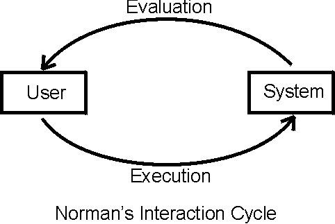
An obvious diagram of the Human-Computer Interface interaction:
Human <—> Interface <—> Computer
The diagram does not illuminate much. Norman’s 1988 book the Design of Everyday Things is one of the first appearance of the phase “user centered design.” Norman’s genius was to view the interaction as a cycle with two components; execution and evaluation:
Viewing the HCI as cycle is an accurate representation with respect to both the user and the system (computer and program) point of views. Execution and evaluation are words the user understands. According to Norman the execution component can be further divided into:
- Establishing the goal
- Forming the intention
- Specifying the action sequence
- Executing the action
The evaluation component is divided into:
- Perceiving the system state
- Interpreting the system state
- Evaluating the system state
From the user’s perspective, the user first establishes a vague goal which the user specifies by forming an intent. Then the user can determine a sequence of actions that the user executes. After the system responds (or maybe before if the system is slow), the user perceives the new system state which the user interprets and evaluates with respect to the user’s intended goal. The cycle repeats. The user forms the execution and evaluation in a task domain, called the task language. The system responses to the user’s action in a different language, called the core language. A major cause of HCI failure is the differences between the two languages. Norman defines to kinds of errors due to the gulf of execution and the gulf of evaluation. A problem with Norman’s model is that it does not make the UI explicit. Abowd and Beale (1991) extended making the UI explicit. There are still two languages, task and core, but the UI is responsible for translation between languages, so the gulfs exist in the UI. The UI is involved in 4 mappings:
- Articulation
- Performance
- Presentation
- Observation
The picture I like to draw is two horse shoes, one representing the system and the other the user. The gap between the horse shoes representing the gulfs in the UI.
I like to think that an expert (experienced in the task) using a well designed HCI resembles two horse shoe magnets properly aligned; the horse shoes are strongly bonded together and the gaps disappear. Have you ever watched an expert user of VI editing? The document editions appear automatically like magic. Or how about a good system administrator using UNIX commands? Both of these interfaces are command line not WIMP interfaces. They work so well because the user has learned a task language that well matches the core language. Each horse shoe leg represents a mapping. The user must map the goals to a sequence of actions, articulation. The system (modeled as a finite state machine) interprets the user’s actions and performs the correct internal change of state; this mapping is called performance. Then the system must present the new internal state, presentation. Finally the user must correctly map the presentation to task language, observation. HCI errors can be associated with the four mappings:
- Articulation
- Performance
- Presentation
- Observation
All four mappings of the windows operating system interface are poor. Consider a user wanting to stop the opening of an unwanted window during booting. If the file is not in the start-up directory then the registry must be edited (another problem). The user can delete the wrong key or entry; representing an articulation error. If the user does not know to edit the registry then the user assumes that it is not possible to get rid of the window; a performance coverage problem. There is no indication that the registry has been edited, another poor presentation. The user may not be able to interpret the keys of the registry properly; an observation problem.
OK this example is too obscure. Consider the MS Word processor. The user using short keys to select a command might press crtl-alt-del accidentally; definitely an articulation error. The user may not be able to find the correct formatting commands in the menus; performance coverage error. Or the user may type :) truly desiring colon and closed parenthesis but Word makes a smiley face; wrong performance. Comparing the printed document with the monitor displayed document the user finds discrepancies. This is a presentation error. The user does not realize that the blue background text is meant to indicate selection (and should not appear in the printed version) – this is an observation error.
Consider another example using a VCR remote control. The user is not sure if the recording is set properly. User presses the wrong button or the wrong sequence of buttons is an articulation error. The VCR can record on any channel but the remote can not access the channel is a coverage or performance error. The VCR does not indicate the channel or the recording is a presentation error. The user misinterprets the VCR symbols is an observation error. More examples of poor mapping interfaces:
Articulation:
- Clustering of light switches in a room
- Adjacent keys causing opposite state changes
- Pressing keys simultaneously
Performance:
- To shut down Windows user must click on START
- User can not find important Windows OS commands
- Applications missing important utilities
- Applications performing the command wrong
Presentation:
- Lack of indication, no visual change in the UI
- Netscape navigator status bar; document done
Observation:
- User falls asleep during boot up and misses important log information :)
- Can not read fonts
- Windows outside of the desktop view port or under other windows


